Moto Guzzi Norge

Yamaha FJR Motorcycle Forum

Help Support Yamaha FJR Motorcycle Forum:

This site may earn a commission from merchant affiliate links, including eBay, Amazon, and others.

designeraccd

Well-known member
Joined
Oct 3, 2005
Messages
248
Reaction score
0
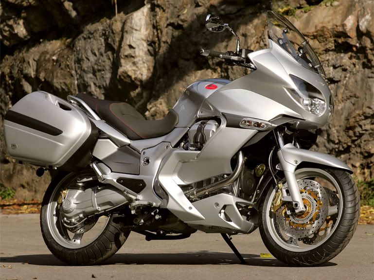
Wow! Just saw a pic of Guzzi's new 1160cc(?) Norge sport touring bike. Lookswise it leaves a FJR in the dust; very interesting design with its transverse Vtwin poking partially through. Definately, in my opinion as an Industrial Designer "smokes" GK Design's efforts on the FJR. BTW they are the ID firm that has done all of Yamaha's "styling" for many years, and overall do a very nice job, too.

DFO :eek:

 
Norge 1200 is equipped with a new version of the legendary 90° V-Twin, of 1200cc, for a great pleasure of riding alone and with passenger, including a serie ABS and with an electrically adjustable windshield. The Norge 1200 will arrive on the market at the end of March 2006.

norge1200.jpg


Last edited by a moderator:
I've never cared for the Guzzi styling in general but that is a good looking bike.

Any info on HP,torque,weight etc....?

Glenn

 
I thought Norge made kitchen appliances. ;)

Actually, I like the look very much. Probably expensive. I will be nice to see the specs on it. The mirrors don't bother me but they are very different from what I expected. Is there a radiator tucked in up high in the front or is it air cooled?

 
Is there a radiator tucked in up high in the front or is it air cooled?
No radiator, the Guzzi's are air / oil cooled.

Bike is very nicely done. Has styling hints of many of the sport / touring bikes on the market.

Not bad, but me don't think it compares to the mighty FJR.

--G

 
Good to see Guzzi adding some style to their line. This attempt however, is too busy for my likes. Brembo ABS is nice, so is the shaft drive and adjustable shield. Under tail exhaust? Looks to have that same trademark Guzzi mongosso kick stand, though...

 
Looks like an ST1300 that got hit with the ugly stick to me! More facets than an F-117. Looks like a magnet got dragged through the junk yard!

:p

 
May be a great bike, but a Guzzi should never hide that gorgeous engine under acres of plastic, and they don't cool very well under there either. I'll take a Griso.

- Mark

 
Good looking bike.

The mirrors suck.

Not sure about the look of the pipes through the middle of the fairing.

A little busy, but still very nice looking. Better than I expected when I saw the title posted.

 
Unlike my eagerly awaited '06 FJR the color useage is cohesive and therefore unifies the somewhat busy body shapes. The one thing I do not like, from the pics, is that huge slash of silver thru the middle breaking up the '06's blue paint...why???

Graphically that makes as much visual "sense" as most RVs hideous paint jobs which, at best, tend to look like explosions in a mattress factory to quote one of my long ago instructors at Art Center College of Design! DFO <_<

 
Looks like an ST1300 that got hit with the ugly stick to me! More facets than an F-117. Looks like a magnet got dragged through the junk yard! :p
I disagree completely!

I think it makes the ST1300 look more like the baby Wing it is (translation: NOT a sport-tourer)--Guzzi has made a GORGEOUS bike (except for those hideous 70's-80's mirrors).

Now there have been rumors MG is FINALLY building an engine with competitive H/P...is this it? If it can't run with the FJR1300 and the K1200S, then it's just a styling exercise--albeit a damn good one! (sans mirrors-wonder how the FZ1 mirrors would look on it?)

 
Nice bike overall although I'm not fond of: The mirrors. the gash in the line of the right fairing to allow for the exhaust to pass by unobstructed, and the open to the elements front wheel ABS wheel position sensor. What happens when that thing gets a little mud on it?

Cheers,

Jim

 
Last edited by a moderator:
BTW, where are the other two?

Well, there's one here in Wichita.

Personally I think it's a damn sexy bike, except for those gay assed chrome mirrors mounted on the bars!! :haha:

Mike

 
I'm thinking they should be showing off more of the motor than just the top of the heads. But my first impression was, gee that looks like a taller FJR!? Guzzi's always cost too much.

 
Unlike my eagerly awaited '06 FJR the color useage is cohesive and therefore unifies the somewhat busy body shapes. The one thing I do not like, from the pics, is that huge slash of silver thru the middle breaking up the '06's blue paint...why???
Graphically that makes as much visual "sense" as most RVs hideous paint jobs which, at best, tend to look like explosions in a mattress factory to quote one of my long ago instructors at Art Center College of Design!  DFO <_<
It's easy to see that they took many of their styling cues from the `52 Norge...

1.jpg


Top