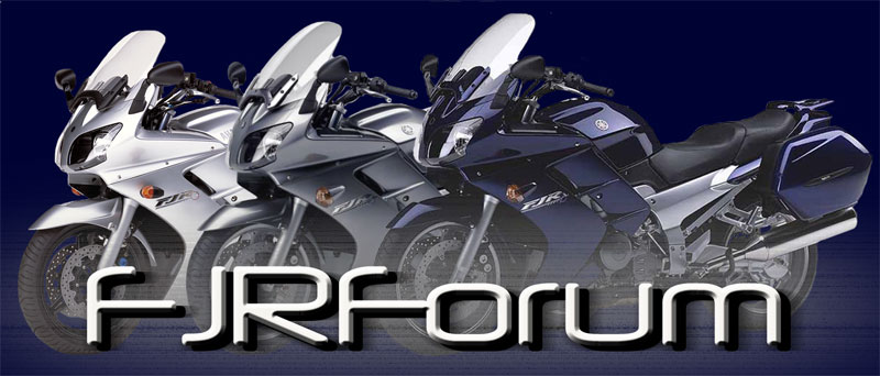
FJR Forum Decal design

Yamaha FJR Motorcycle Forum

Help Support Yamaha FJR Motorcycle Forum:

This site may earn a commission from merchant affiliate links, including eBay, Amazon, and others.
Status
Not open for further replies.
OEM top case or none. With the side stand down is a odd angle
Biased answer here, But I have always Loved the nose of these beasts. I'll even submit my profile pic as rough draft.
 
Hi all
We are having a FJRForum decal designed. Below is the design. It is based off a few photos that members have shown on the forum. What do you think? Does it look enough like the FJR?

I agree with many of the other members. It would look better without the top box or go with the OEM if you are going to have one on it.
 
Why not, If I was going to change any thing I'd put an 07 Black Cherry in the center.
 
To use a forum banner, I think it would look a bit "too much"...a motorcycle forum sticker needs to be simple and recognizable, especially from a distance, something like this;
Screenshot_20230705_235016_Chrome.jpg
It also needs to be simple and easy to replicate on embroidery machine, on the pin, on the shirt, hat etc
It doesn't necessarily have to feature the complete picture of a motorcycle.

Simple and recognizable FJR contours (panniers should be added to design below for sure):
Screenshot_20230706_001813_Chrome.jpg
And feature the familiar FJR logo
Screenshot_20230706_002226_Chrome.jpg
And also feature the familiar forum fonts
Screenshot_20230706_002449_Chrome.jpg
Alternatively hi contrast bike silhouette
Screenshot_20230706_001033_Chrome.jpg
 
Last edited:
My vote is no top box. Also, incorporating the tuning forks or an FJR insignia somewhere....
 
I am going to go against the grain - I like the decal with the top box. I use a Shad top case which looks a little like the Givi. The profile of the decal looks pretty similar to mine. I would buy one!
 
Hi all
We are having a FJRForum decal designed. Below is the design. It is based off a few photos that members have shown on the forum. What do you think? Does it look enough like the FJR?

Ditch the top box and the thingy rising from the handle bars.
Put a tuning fork on the tank.
Capitalize the fjr in fjrforum.
Paint it red like the 2014.
 
Hi all
We are having a FJRForum decal designed. Below is the design. It is based off a few photos that members have shown on the forum. What do you think? Does it look enough like the FJR?

I'd say it does look like the FJR aside from that rounded lower portion of the headlight. Also, I oppose that top case for the following reasons...,
It's unnecessarily huge to the point of appearing disproportionate and it takes away from the bike itself. Also, it's clearly a representation of a GIVI product and suggest its removal or redesign. Now, if this Forum is receiving kick-backs from GIVI to include it, then politics will dictate the outcome and soliciting opinions would be condescending at best if the end-game is a foregone conclusion.
Let's pretend no money is changing hands..., if removal is not an option, then I suggest a tactfully resized, OEM, colour-matched representation thereof be put in its place. (Nothing against GIVI as I have two of their top cases for my own FJR). I also like the previous suggestion for additional contrast. Thanks for asking.
 
Can someone post a close up or good photo of the "tuning fork".
 
Did a little research on decals... It's supposed to be an 'artistic' rendition of the FJR. Hence the somewhat 'cartoonish' appearance. That being said, I agree with others in favor of losing the top box all together. Since the tagline advertises the FJR forum, the bike itself probably doesn't need a brand mark. Otherwise, it looks enough like an FJR for the intended purpose, in my opinion. ;)
 
Status
Not open for further replies.
Top