You are using an out of date browser. It may not display this or other websites correctly.
You should upgrade or use an alternative browser.
You should upgrade or use an alternative browser.
FJR Forum Decal design
- Thread starter Cycle
- Start date
Help Support Yamaha FJR Motorcycle Forum:
This site may earn a commission from merchant affiliate
links, including eBay, Amazon, and others.
- Status
- Not open for further replies.
Drop the top box or if it must have a top box, OEM please.
FJROwner
Member
No top box or use OEM box, photo not cartoon, must have logo.
At least represent each Gen.
i agree with the rest,lose the topbox
Your right!I'm not a fan of the Yamaha OEM top box. So, for me, I'd prefer it had no topbox, but if you are including one, then it needs to be OEM.

$7.49
$14.99
WTACTFUL Tactical Gloves for Men, Summer Motorcycle Cycling Motorbike Driving Riding Hunting Outdoor Work Fingerless Half Finger Gloves Men Women Black XL
WTACTFUL Trading Co.,Ltd

$14.99
$17.99
MELASA Fleece Lined Winter Cycling Beanie with Holes for Glasses - For Men, Women
HNXCHUANG

$89.45
No Cutting Motorcycle Frame Slider Anti-collision Drop For Yamaha FJR1300 FJR 1300 2006-2011 motorcycle crash pad(Carbon Fiber Look)
dengzhoushijiushuncaishangmaoyouxiangongsi

$79.95
Harley-Davidson Water-Resistant Travel Hybrid Duffel Bag/Backpack - Black
Wisconsin Harley-Davidson

$159.99
FLAVOR Men Brown Leather Motorcycle Jacket with Removable Hood (Large (US standard), Brown)
FLAVOR Leather

$19.99
MOREOK Winter Gloves -10°F 3M Thinsulate Warm Gloves Bike Gloves Cycling Gloves for Driving/Cycling/Running/Hiking-Black-L
MOREOK-US (Ships from USA)

$98.16
25-1775 Replacement for All Balls Wheel Bearing Kit (25-1775) for Yamaha FJR1300 03-16 FJR1300ES 14-18
Otisdelilah Auction

$55.09
$58.00
WILD HEART Waterproof Motorcycle Duffel Bag PVC500D Double-bottom With Rope Straps and Inner Pocket 40L 66L 100L for Kayaking, Camping, Boating,Motorcycle
ZHONGSHAN WILD FRUIT OUTDOOR

$24.37
Fuel Tank Sticker Motorcycle Stickers for Yam&aha FJR1300 FJR 1300 Tank Pad Protector Decal Emblem Side Fairing Symbol Adventure
nanyangshixianpushangmaohanggerenduzi

$64.99
Edwards Oil Change Kit fits 2003-2020 Yamaha FJR1300 Sport Touring
Edwards Motorsports & RV's
Not cartoonish enough, not red enough and needs a much larger topbox. Needs to look like it's passing through a time warp. Come on guys, where's your sense of humor!!! I mean 9 pages of drivel, really??? The original posting was probably a joke to begin with!!!
dan

An equal opportunity offender!!
dan
An equal opportunity offender!!
nvmike24
New member
As is looks great.
I agree with what has been said, no top box and an FJR logo.
MotoMike
Well-known member
No to the top box
msiegle
Member
I'd also say remove the top box.
https://duckduckgo.com/?t=ffab&q=yamaha+logo&iax=images&ia=images&iaf=size:WallpaperCan someone post a close up or good photo of the "tuning fork".
czufelt
Active member
The increased contrast looks better. And no top box.
Get rid of the top box.Hi all
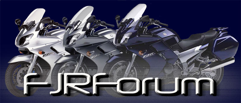
We are having a FJRForum decal designed. Below is the design. It is based off a few photos that members have shown on the forum. What do you think? Does it look enough like the FJR?
Add me to the no top box group
No top box.Hi all
We are having a FJRForum decal designed. Below is the design. It is based off a few photos that members have shown on the forum. What do you think? Does it look enough like the FJR?
gbrmksmith
Well-known member
Look's good.
+ whatever it's up to on losing the top box. Otherwise looks pretty good.
- Status
- Not open for further replies.
Similar threads
Motorcycle For Sale
2008 FJR for sale
- Replies
- 2
- Views
- 1K
- Replies
- 4
- Views
- 974


