You are using an out of date browser. It may not display this or other websites correctly.
You should upgrade or use an alternative browser.
You should upgrade or use an alternative browser.
FJR Forum Decal design
- Thread starter Cycle
- Start date
Help Support Yamaha FJR Motorcycle Forum:
This site may earn a commission from merchant affiliate
links, including eBay, Amazon, and others.
- Status
- Not open for further replies.
Reborn Rider
Member
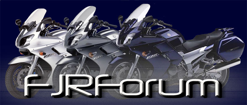
The bike is fine, but the trunk appears to be a Givi. I would prefer to see an OEM Yamaha trunk.
FJR Steve
Well-known member
I'm not a fan of the Yamaha OEM top box. So, for me, I'd prefer it had no topbox, but if you are including one, then it needs to be OEM.
It does but it also looks like other bikes. Is there a reason there is no logo on it that defines it as an FJR?
two wheels
Well-known member
I prefer no top box
RTSR1/FJR
Gort - Klaatu barada nikto!
Doesn’t look like my ‘03, but that’s ok! I’m ok with it!

$15.15
$21.95
Tough Headwear Balaclava Ski Mask - Winter Face Mask for Men & Women - Cold Weather Gear for Skiing, Snowboarding & Motorcycle Riding (Black)
Tough Outfitters

$22.09
$25.99
MOREOK Waterproof & Windproof -30°F Winter Gloves for Men/Women, 3M Thinsulate Thermal Gloves Touch Screen Warm Gloves for Skiing,Cycling,Motorcycle,Running-Black-L
MOREOK-US (Ships from USA)

$127.99
$159.99
FLAVOR Men Brown Leather Motorcycle Jacket with Removable Hood (Large (US standard), Brown)
FLAVOR Leather

$24.37
Fuel Tank Sticker Motorcycle Stickers for Yam&aha FJR1300 FJR 1300 Tank Pad Protector Decal Emblem Side Fairing Symbol Adventure
nanyangshixianpushangmaohanggerenduzi

$44.99
Real Time Industries Reflective Decals for Yamaha FJR1300 Gen 2 Fairing (Black - Silver Print)
Real Time Industries

$49.00
WILD HEART Waterproof Motorcycle Duffel Bag PVC500D With Rope Straps and Inner Pocket 40L 66L 100L for Kayaking, Camping, Boating,Motorcycle
ZHONGSHAN WILD FRUIT OUTDOOR

$64.99
Edwards Oil Change Kit fits 2003-2020 Yamaha FJR1300 Sport Touring
Edwards Motorsports & RV's

$22.09
$25.99
MOREOK Waterproof & Windproof -30°F Winter Gloves for Men/Women, 3M Thinsulate Thermal Gloves Touch Screen Warm Gloves for Skiing,Cycling,Motorcycle,Running-Black-XL
MOREOK-US (Ships from USA)
JREW
Well-known member
No top box or at least an OEM.
- Joined
- Jul 3, 2015
- Messages
- 494
- Reaction score
- 649
How big is this decal? I copied the image and blew it up. It looks like an FJR in a cartoonish kind of way. If it is a cartoon, it would be nice to have the Yamaha tuning fork insignia with enough resolution to identify it on it somewhere like the tank. Also, if it's a cartoon, why not just put "FJR" on the side bag. I also would vote to lose the top box.
RiderJoe
Well-known member
I am with @two wheels and others on losing the top box. It doesn’t come with an FJR anyway. If we want to add accessories, then we can add aux lights, backrests, GPS, etc. Keep it simple, IMHO.I prefer no top box
@harper ’s suggestion is good. Perhaps a larger Yamaha logo screened back behind the bike (w/o the top box), and forum name? It would tie the logo elements - the bike image and forum name text - together nicely.
Last edited:
Great just remove the boxHi all
We are having a FJRForum decal designed. Below is the design. It is based off a few photos that members have shown on the forum. What do you think? Does it look enough like the FJR?
boogahboogah
Well-known member
I use a Givi top box. Don't really care if there is a top box or not. Image could be better defined...
Knifemaker
Not me
I agree with what’s been said, OEM top case or none. Needs a FJR logo.
Mihalis fjr
Well-known member
Well,I don't like it very much..I would like to see a Gen1 or a Gen2 with the oem top case or without a top case.This is a Givi top case..Also the side cases are the city version and not the touring version..The picture looks like a cartoon picture..Anyway,again,i don't like it very much but it is only my thought...Some will like it and some other they don't like it...
RossKean
Well-known member
Last edited:
VAcracker
Well-known member
- Joined
- Apr 12, 2022
- Messages
- 210
- Reaction score
- 219
The image is ok
Minor critiques
1. It looks a little
Cartoony / casual
2. The panniers look like FJ or Tracer not FJR
3.Foot pegs are missing
Color is boring
4. Trunk does not add much and looks bulky
Depending on the purpose the image does strongly resemble an FJR. I think it looks good and few people will notice the nit picky stuff. The font fits well with the image.
If the intent is for bulk purchase of stickers or something it could be good fit and compromise of accuracy and price consciousness.
If the intent is long term image for forum maybe some refinement could be beneficial. But everything can be subjective to personal opinions.
Last edited:
sidewinder
Active member
My suggestion is no top box and to make it look less like a "cartoon"
John d
Well-known member
Pass, Next?
FJRPittsburgh
Rally Addict
I would prefer a Givi trunk. I both own and the Yamaha trunk is a heavy monstrosity with little storage. The image looks wonderful.The bike is fine, but the trunk appears to be a Givi. I would prefer to see an OEM Yamaha trunk.
Yup, ditch the topbox and crank up the contrast.
No top box.
- Status
- Not open for further replies.
Similar threads
Motorcycle For Sale
2008 FJR for sale
- Replies
- 2
- Views
- 1K
Motorcycle For Sale
2008 Gen2 For Sale - Prescott AZ Tons of Extras. Price Drop
- Replies
- 3
- Views
- 532


