Most Desireable FJR Instrument Cluster

Yamaha FJR Motorcycle Forum

Help Support Yamaha FJR Motorcycle Forum:

This site may earn a commission from merchant affiliate links, including eBay, Amazon, and others.

Mike Aldea

FJR/Concours Pilot
FJR Supporter
Joined
Jul 16, 2010
Messages
232
Reaction score
25
Location
Hawthorne, NJ
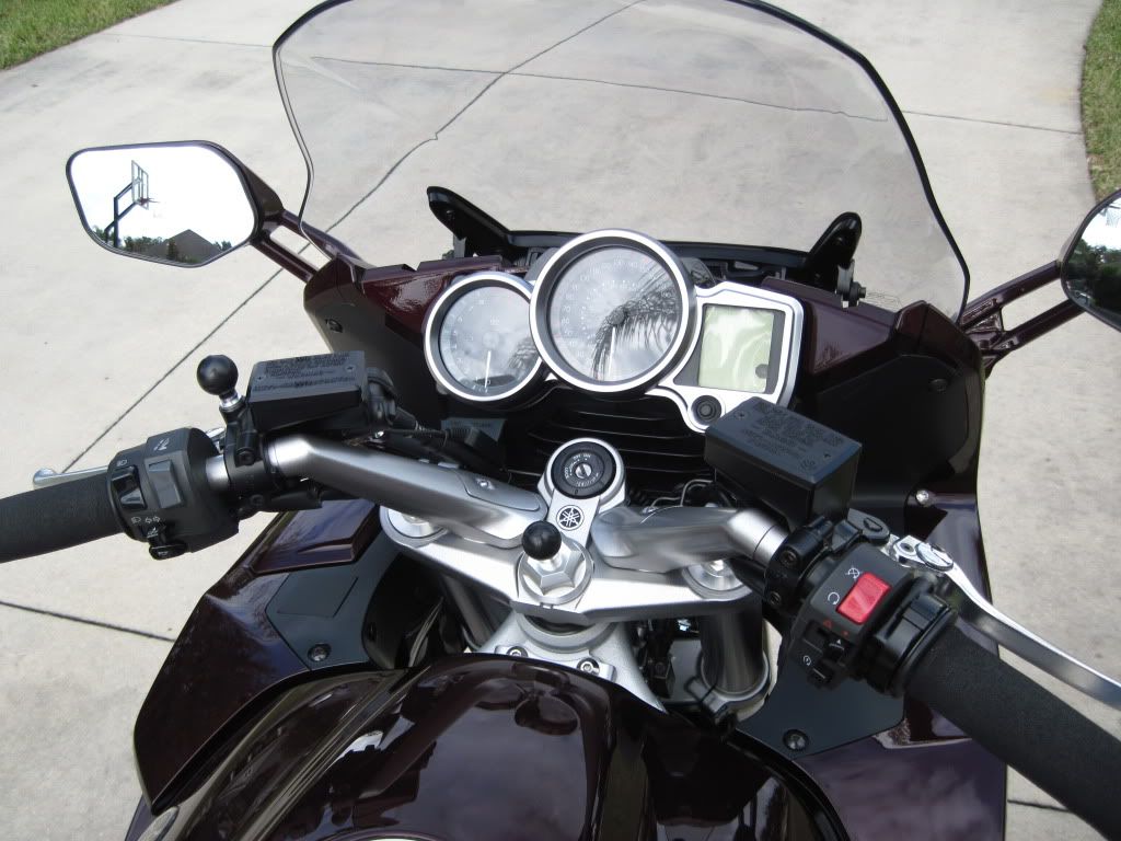
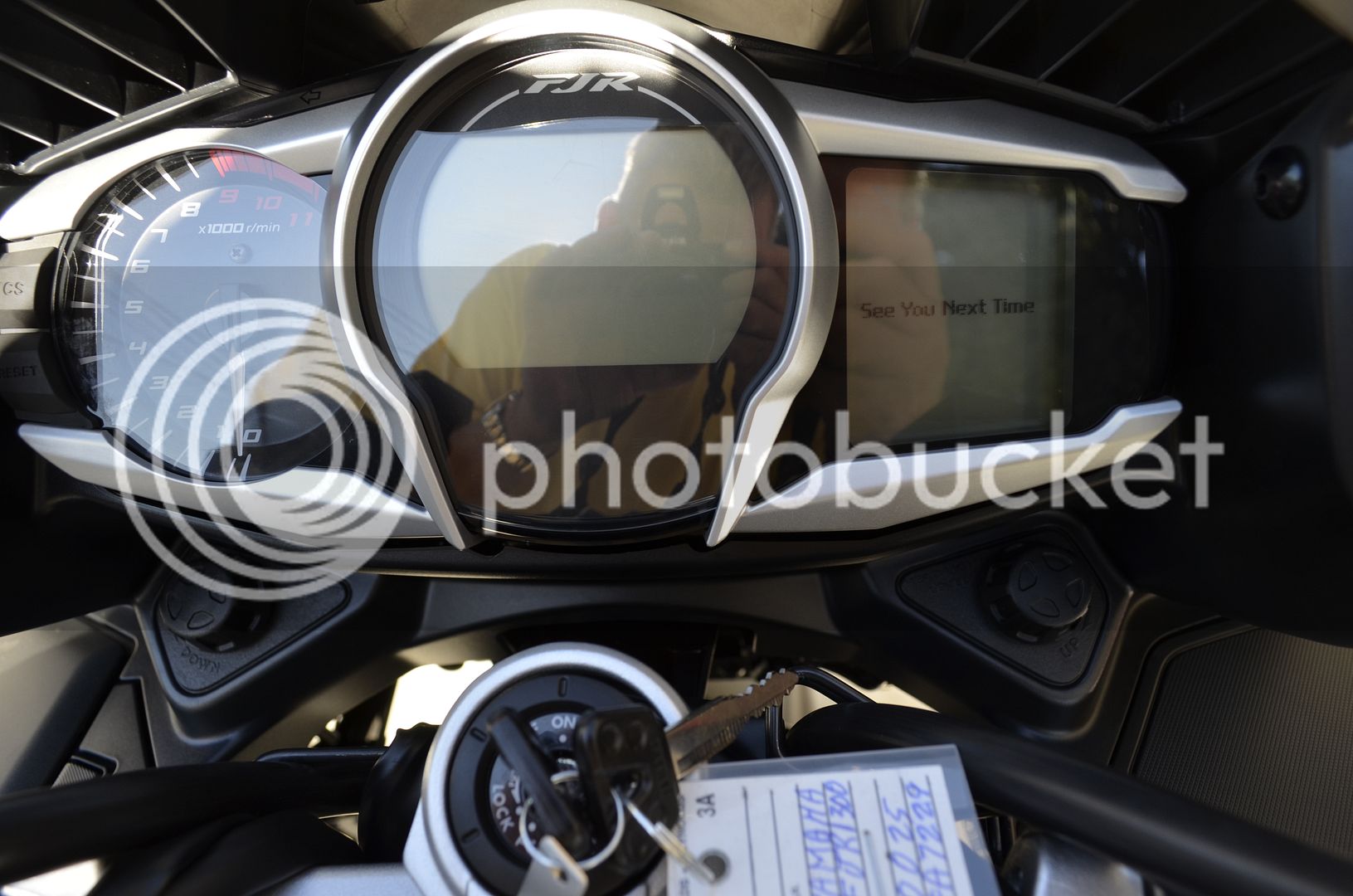
Being that today is Friday, I thought it was the perfect day to ask this question. Keeping in mind that I have yet to even ride an FJR, I think the design layout of the Gen I instrument cluster is far superior to the renditions that followed in Gen II & III.

Gen I

fjr7.jpg


Gen II

IMG_0668.jpg


Gen III

file-4.jpg


So as I start to slide into my foxhole,
foxhole-buddy-icon.gif
let me ask what do you all think?


Too easy...moving upscale with each generation from plain black plastic to a modern dash. GENIII is pretty sweet!

...joining you in the foxhole.
ph34r2.gif


--G

 
So you prefer the Gen I instrument cluster, I bet you still have that wonderful avocado-green color on all your kitchen appliances that was so popular back in the 60's.

 
Last edited by a moderator:
This is too opinion based. It's like asking which one of Hugh Heffner's girlfriends is the most attractive.

I think the Gen2 dash is beautiful to look upon. The color and style of the gauges, the color of the backlight, all add up to a really attractive layout. The problem is the #'s on the speedo are so small and there are so many of them that it is almost useless. It is especially aggravating for those who wear glasses.

Gen1 is easier to read the basics than the Gen2, but it is starting to look a little dated. Looks to me like the Gen3 is the best so far.

 
I like that the Gen I turn signal indicators are nice and big. The II's are pretty small and hard to see by comparison. III's? Dunno.

Biggest disadvantages of the I's, to me, is no gear indicator or temp gauge. I'd like both of those, in that order. Digital vs. analog speedo? Both work. Looks? Gotta admit, the III, IMO.

 
Mike! You need to upgrade the prescription on your glasses my friend. That GenI Dash layout looks like Moist ***!! Having had a lot of Moist *** in my lifetime I can tell you that its waaay better than that Fugly GenI dash!
puke.gif


I think all the different dashes look great on the FJR,

at the same time, I agree with Escapefjrtist that the Gen 3 is a step above the rest.

Yamaha did a great job with the new dash design.

It is always impressive to see Yamaha as a corporation striving to meet the demands of their consumer,

and at the same time make profits for their company.

Companies like this general last a long time by being innovative,

and consumer as a result tend build loyalty to these companies in the long-run :)

 
So you prefer the Gen I instrument cluster, I bet you still have that wonderful avocado-green color on all your kitchen appliances that was so popular back in the 60's.
No, but my apartment which was built in the '60s does have a pink bathroom. Plus I do ride a 17 year old motor.

 
Last edited by a moderator:
Mike! You need to upgrade the prescription on your glasses my friend. That GenI Dash layout looks like Moist ***!! Having had a lot of Moist *** in my lifetime I can tell you that its waaay better than that Fugly GenI dash!
puke.gif
I may not be a brother but I've got to agree with Sir-Mix-A-Lot.


I apologize it the last video offends anyone and admins should not hesitate to delete it if it is outside the forum guidelines.

 
Last edited by a moderator:
I think the 1st Gen cluster looks a little clunky and dated. It is; however, functional.

I prefer my Gen 2 cluster, but from the pictures I have seen of the Gen 3s, the updates look pretty cool. Since I don't own a Gen 3 I'm thinking my opinion of the cluster probably doesn't matter.

 
One feature I do miss from the Gen I is having both the trip meter and odometer displayed. I think the Gen III dash has great potential...

 
The clusters get more refined with each generation. Having had a GenII and now a GenIII I have to say the GenIII is far and away better. I mean, you can program what information you want to see. Different info is important to different people and the GenIII lets you choose. Gotta love that.

 
[quote name=SacramentoMike" post="1021913" time="1354945732"]Some of the *** in that last vid of Mike A's looked a little moist. Guess you didn't like that, Majic?
laugh.png


Moist *** is Wonderful, it's the looks of the GenI cluster I was talking about!
grin.gif
 
What should a dash be if not functional?

I really don't see how one dash is any more or less attractive than the others. You guys concerned with "style" sure seem to be in touch with your feminine sides, that's all I can say...
kiss.gif


Now, as for which is the most functional dash?

I like some of the features in the first gen: Easy to read numerals, large attention getting turn signals, etc. I do wish it had an ambient temp display specifically for when riding on days near freezing but wet, but from what I've heard you can't really believe the one on the 2nd gen anyway. So maybe an after market stick on thermometer with a remote sensor and I'll be good to go?

Some of the other stuff that 2nd gen brought along like mpg display and gear indicator I could care less. I know what gear I am in by the tachometer and the mpg meter lies badly with a PC installed. Third gen definitely brings some new features to the party and very well may be the best one (functionally) yet.

Now, here's a great functional looking dash:

1012850_600.jpg


Last edited by a moderator:
Top