Agree with suggestions to delete the top box.
You are using an out of date browser. It may not display this or other websites correctly.
You should upgrade or use an alternative browser.
You should upgrade or use an alternative browser.
FJR Forum Decal design
- Thread starter Cycle
- Start date
Help Support Yamaha FJR Motorcycle Forum:
This site may earn a commission from merchant affiliate
links, including eBay, Amazon, and others.
- Status
- Not open for further replies.
09Raven
Member
No top box please.Hi all
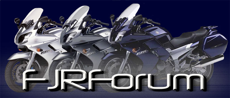
We are having a FJRForum decal designed. Below is the design. It is based off a few photos that members have shown on the forum. What do you think? Does it look enough like the FJR?
joshanderson2008
New member
Looks good. Remove top box. My $0.02.Hi all
We are having a FJRForum decal designed. Below is the design. It is based off a few photos that members have shown on the forum. What do you think? Does it look enough like the FJR?
jwgoldin
Member
No top box and a different body color is my vote.
albie438
New member
since you asked for opinions....Lose the top box. I don't mind the cartoon/abstract effect but this is going too far towards being a photo. FJR owners know the lines of our bikes and IMO that's all you really need to suggest.

$7.99
$10.99
AstroAI Ski Mask Windproof Balaclava for Cold Weather, Winter Face Mask Breathable Stretchable for Skiing, Snowboarding, Black
AstroAI Direct

$159.99
$199.00
FLAVOR Men Brown Leather Motorcycle Jacket with Removable Hood (Large (US standard), Brown)
FLAVOR Leather

$44.99
Real Time Industries Reflective Decals for Yamaha FJR1300 Gen 2 Fairing (Black - Silver Print)
Real Time Industries

$46.95
Harley Davidson Logo Sport Duffel (Tail of The Dragon), Black, One Size
Wisconsin Harley-Davidson
Add the Tuning Forks symbol and Yamaha emblem on the pannier.
With or without the Top case. Doesn't make a difference to me.
With or without the Top case. Doesn't make a difference to me.
fastpappy
Well-known member
As others have said. No top box and looks cartoonish, prefer an actual photo of a real FJR.
HaulinAshe
Well-known member
Probably as appropriate a place as any for my final post. My FJR days are ended. Basically gave-away my last of four FJRs to Beachy's son several months ago. It's a bittersweet end to 15-years and over 350,000 FJR miles. I even traded in the Ducati and bought a new 2022 Tracer 9 GT. Hoping health improves and I get back on the bike soon.
Now to be back on topic... I prefer an FJR logo WITH a top box. You see way more with than without. And my motto has always been... Once you go top box, you'll never go back. But I also agree it needs to be a Yami top box and the tuning fork logo should be clearly discernable at all viewing/printing levels. It's a family crest for me that goes all the way back to 1960s. FJRs are Yamahas, plain and simple. Display it with pride.
Ya'll have fun! Hopefully I'll join you again on some actual touring rides across this great country.
Dado
New member
My 2 cents:
- The top box needs to go, not the OE box and top boxes are ugly anyway
- The proposed FJR image is not exactly "screaming FJR" and only people that are familiar with FJR will recognize the FJR
- Background Yamaha and FJR1300 logo would greately help the sticker design
- Colors: Yamaha is associated with BLUE so the sticker should have blue bike. (I owned '05Blue and '17Matte Silver, but the '14RED is my favorite, so Red FJR sticker could be an option)
- I would use the image that shows "the Face of the bike" or the front, since most bikes are recognized better once you see the headlights "the eyes" or the "Face" of the bike. Also bikes are looking the best when photographed at the slight angle, like this for example:
Attachments
I like the design. Yamaha would probably squawk if the tuning forks or their name was added.
roger dodger
Well-known member
Simple ...
- Drop the Top Box
- Add the Tuning Fork/ FJR logo
- Use a real pic or better cartoon
Ride more ... survey less.
- Drop the Top Box
- Add the Tuning Fork/ FJR logo
- Use a real pic or better cartoon
Ride more ... survey less.
Orygun_Man
Member
I agree as well. No top box
brady
Live the Adventure, Ride the World
I would do no top box, but if it needs to have a top box it should be OEM. I also think a bike in action would look cool.
juniorfjr
Well-known member
It's OK. Agree, no top box
BkerChuck
Second hand vegetarian
Delete top box and rework side case covers. Currently they look like the bags on the Tracer GT
No top box. A more interesting color would help, it looks like a B&W photo.
- Joined
- Jul 3, 2015
- Messages
- 492
- Reaction score
- 648
Tru dat, Charles. Yamaha would probably make someone pay for using their logo. But then you use it as your avatar and they haven't come after you yet.I like the design. Yamaha would probably squawk if the tuning forks or their name was added.
Dan Fellows
New member
Hi all
We are having a FJRForum decal designed. Below is the design. It is based off a few photos that members have shown on the forum. What do you think? Does it look enough like the FJR?
user 90243
Well-known member
- Joined
- Oct 26, 2016
- Messages
- 168
- Reaction score
- 82
Add OEM logo on side cover. Big enough to see.It does but it also looks like other bikes. Is there a reason there is no logo on it that defines it as an FJR?
- Status
- Not open for further replies.
Similar threads
Motorcycle For Sale
2008 FJR for sale
- Replies
- 2
- Views
- 1K
Motorcycle For Sale
2008 Gen2 For Sale - Prescott AZ Tons of Extras. Price Drop
- Replies
- 1
- Views
- 297


