Yep, lose the top box.
You are using an out of date browser. It may not display this or other websites correctly.
You should upgrade or use an alternative browser.
You should upgrade or use an alternative browser.
FJR Forum Decal design
- Thread starter Cycle
- Start date
Help Support Yamaha FJR Motorcycle Forum:
This site may earn a commission from merchant affiliate
links, including eBay, Amazon, and others.
- Status
- Not open for further replies.
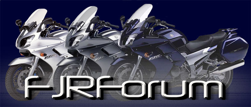
I agree to much detail in the original design. It's purpose is a sticker. Trying to jam so much detail in such a small area looses the effectiveness of the design and purpose. Top case is a accessory and not how the FJR is sold. The top case may throw the design off when looking at a quick look. Not sure if someone will take the time to study the design to take notice that the bike is a FJR.To use a forum banner, I think it would look a bit "too much"...a motorcycle forum sticker needs to be simple and recognizable, especially from a distance, something like this;
View attachment 4876
It also needs to be simple and easy to replicate on embroidery machine, on the pin, on the shirt, hat etc
It doesn't necessarily have to feature the complete picture of a motorcycle.
Simple and recognizable FJR contours (panniers should be added to design below for sure):
View attachment 4877
And feature the familiar FJR logo
View attachment 4878
And also feature the familiar forum fonts
View attachment 4879
Alternatively hi contrast bike silhouette
View attachment 4881
Looks good to me now. 
Panman
Well-known member
Better
Looks good

$22.09
$25.99
MOREOK Waterproof & Windproof -30°F Winter Gloves for Men/Women, 3M Thinsulate Thermal Gloves Touch Screen Warm Gloves for Skiing,Cycling,Motorcycle,Running-Black-L
MOREOK-US (Ships from USA)

$49.99
$54.99
HOOD CREW Men’s Casual Stand Collar PU Faux Leather Zip-Up Motorcycle Bomber Jacket With a Removable Hood
Jamickiki

$24.37
Fuel Tank Sticker Motorcycle Stickers for Yam&aha FJR1300 FJR 1300 Tank Pad Protector Decal Emblem Side Fairing Symbol Adventure
nanyangshixianpushangmaohanggerenduzi

$64.99
Edwards Oil Change Kit fits 2003-2020 Yamaha FJR1300 Sport Touring
Edwards Motorsports & RV's

$127.99
$159.99
FLAVOR Men Brown Leather Motorcycle Jacket with Removable Hood (Large (US standard), Brown)
FLAVOR Leather

$15.15
$21.95
Tough Headwear Balaclava Ski Mask - Winter Face Mask for Men & Women - Cold Weather Gear for Skiing, Snowboarding & Motorcycle Riding (Black)
Tough Outfitters

$44.99
Real Time Industries Reflective Decals for Yamaha FJR1300 Gen 2 Fairing (Black - Silver Print)
Real Time Industries

$22.09
$25.99
MOREOK Waterproof & Windproof -30°F Winter Gloves for Men/Women, 3M Thinsulate Thermal Gloves Touch Screen Warm Gloves for Skiing,Cycling,Motorcycle,Running-Black-XL
MOREOK-US (Ships from USA)
I like the logo. I would like the tuning forks if you can fit them in or use them as background.
Dado
New member
RossKean
Well-known member
Something isn't quite right with the windscreen. Too small and the angle seems odd. Left mirror sticks out too far.
The color is OK but really not a common one - closest to the Matte Blue, I think (2018 and 2019). I think the Cobalt Blue is a more iconic Yamaha color.
Even the Galaxy Blue.
I assume the design is stylized enough (and without tuning fork) to prevent issues with copywrite infringement?
What is the intent for making these stickers? (assume to raise money to support forum?)
How large are they?
To go on a surface or behind glass (i.e. car rear window)?
Waterproof? UV fade resistant?
Expected cost?
It doesn't look fast enough. Make it red!

- Joined
- Oct 27, 2021
- Messages
- 343
- Reaction score
- 154
I haven't set the size, but about 5 inches across and less than 4.25 inches tall. They do well on outdoors equipment. At the beginning there will be 2 each for supporting members as a little extra 'Thank you" for helping to support the forum.
So, these are not perfect but do they bring to mind the FJR? We want near but not too exact so they won't be considered. The will go on surface.
So, these are not perfect but do they bring to mind the FJR? We want near but not too exact so they won't be considered. The will go on surface.
sapest
Well-known member
Much improved. No chance of switching to the correct side bags? A ’more Yamaha’ blue would great.
-Steve
- Joined
- Oct 27, 2021
- Messages
- 343
- Reaction score
- 154
Can you show me one with "correct side bags"?Much improved. No chance of switching to the correct side bags? A ’more Yamaha’ blue would great.
-Steve
RossKean
Well-known member
Those look a little narrower than the standard cases but you can't really tell. (Not a big deal IMHO).Can you show me one with "correct side bags"?
Those may be closer to the "City" cases that Yamaha sells.
https://www.yamaha-motor.ca/en/accessories/motorcycles/luggage-racks/city-side-cases/5JW-W0753-KT
75 mm narrower than standard cases.

sapest
Well-known member
RaiderBill
Well-known member
Prefer without top box, even though I have an oem box on my fjr. It does look better without, just not as functional.
- Status
- Not open for further replies.
Similar threads
Motorcycle For Sale
2008 FJR for sale
- Replies
- 2
- Views
- 1K
Motorcycle For Sale
2008 Gen2 For Sale - Prescott AZ Tons of Extras. Price Drop
- Replies
- 3
- Views
- 534


