Kawasaki GTR1400 - Son of Concours

Yamaha FJR Motorcycle Forum

Help Support Yamaha FJR Motorcycle Forum:

This site may earn a commission from merchant affiliate links, including eBay, Amazon, and others.
Ooooh, hadn't thought about that. Lemme pop FF open and try...

Tanks! :good:

That worked! Looks sweet. Tight ergos?

Hey, didja notice how well that sidestand worked? Fred? Fred?

:lol:

 
Hey, didja notice how well that sidestand worked? Fred? Fred?
:lol: :lol: :lol:

Unlike the rider in the vid, I think I would've done the classic "kick forward" move on the sidestand after lowering it... sure would be unseemly to have that moster bike take a spill during it's press launch.... :blink:

:D

 
Last edited by a moderator:
The GTR 1400/ Concours14 might be just what the doctor ordered for me to turbo charge. Since Mr. Turbo and others are working on a turbo system for the ZX-14 it should also work for the new Connie.

Things that make you say " Hmmmmmm."

 
Pretty cool video, wished we could of seen the whole clip. Still would'nt change my mind about the FJR, unless it had all the farkles we presently have in a organized, well thought out dash, then maybe.. I'd take a peek.

 
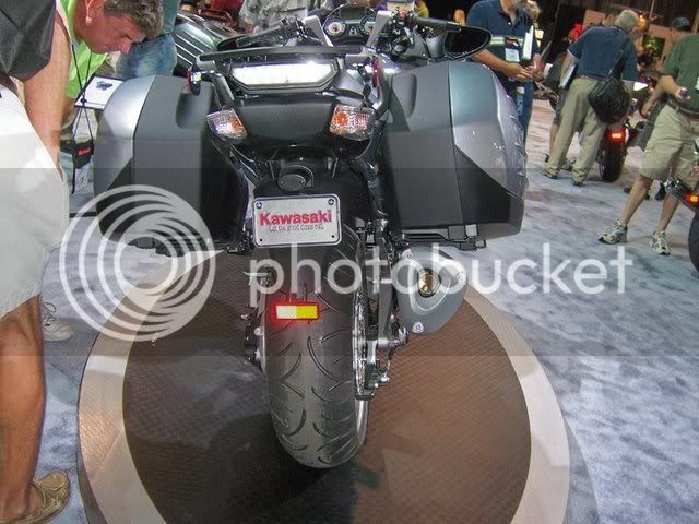
Below is a link to more Concours14 photos from a bike show (sorry if it's been posted before). I got it from a fellow biker at work. It'll give me something to look over when my YES is up in 2008 on my 04 FJR.
Concours14

Tom
Did someone say more ponies?? Damn it just when I told my wife this one (FJR) was it - my dream bike - but wait the large trash can under the bags and no pictures without the bags - i can leave my baggage at home when I visit the psychiatrist for my pony envy problems! and keep the cash for farkles

 
Once I wear out my current Feej ('05)... I would consider it; Kaw seems to be staying on the sport side of ST, while the Feej seems to be heading toward the touring side, based on recent changes.

 
Below is a link to more Concours14 photos from a bike show (sorry if it's been posted before). I got it from a fellow biker at work. It'll give me something to look over when my YES is up in 2008 on my 04 FJR.
Concours14

Tom
Well, I finally took a look at that link. Yikes! Can you say FUGLY! I'll be very interested to see what it looks like in person, cause in these photos it looks like moist *** cheese!

100_0618_65_1_1.JPG


100_0622_69_1_1.JPG


100_0564_11_1_1.JPG


Part of the problem is that those photos were snapped off under fluorescent lighting by a casual photographer, and part of the problem is that silver paint is pretty hideous, agreed.

When one sees the bike in person under natural sunlight, a better determination can be had.

 
Well, I finally took a look at that link. Yikes! Can you say FUGLY! I'll be very interested to see what it looks like in person, cause in these photos it looks like moist *** cheese!
Self-reflecting again, skoot? :lol: Did you look at that intro vid that WC posted? Looks mucho better there than in the photos, IMO.

 
Last edited by a moderator:
Well, I finally took a look at that link. Yikes! Can you say FUGLY! I'll be very interested to see what it looks like in person, cause in these photos it looks like moist *** cheese!
Self-reflecting again, skoot? :lol: Did you look at that intro vid that WC posted? Looks mucho better there than in the photos, IMO.
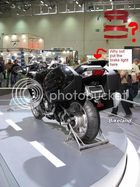
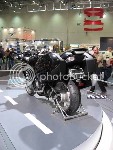
Earlier someone posted a pic of the GTR and FJR side by side. What I noticed is that the outline of the bikes' shapes are very, very similar. When you get in and look at the details, I think the GTR is incredible busy. The rear end design looks really cluttered with the brake and indicator lights at different levels. It looks as though an aweful lot of corners were cut to just get the thing together.

When looking from the front of the bike, the high blacked out dash behind the windscreen is reminiscient of the R1150RT, which I always thought looked a bit stranged in that the fairing was so high compared to the glass.

When looking from the side, the subframe just looks cluttered and disjointed and that reflector on the side of the rear rack is just plain ol stupid.

The front light assembly looks better than the BMWs and ST and is fine by me. The FJR front end is good too (I like the earlier model best)

TWN is right, the video was cool. Makes me want to go make a video of me riding some of my favorite roads on the FJR to see if I look that cool when I ride ;)

 
The black version definitely looks a little better than the silver.... it always does in the showroons, but rarely after that:
intermot06_20.jpg


intermot06_21.jpg


Last edited by a moderator:
The black version definitely looks a little better than the silver.... it always does in the showroons, but rarely after that:
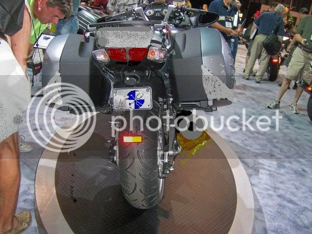
The back end of that bike is too busy...

Hmm...Knight Design comes in and:

GTR1.jpg
GTR.jpg


And since I know you like that change...how about we split the brake light a la FJR and go with a round muffler and paint the entire outside of the sidecase the body color...now this looks way better!!!

GTr2a.jpg


As compared to: (try to deny my design looks better!)

GTr2.jpg


Last edited by a moderator:
And since I know you like that change...
:blink:

Me, I don't really give a rip about appearances, cosmetics and all that happy ****.

I'm just interested in the performance of the machine. B)

Putting the rear brake light on top of the rear rack doesn't make sense to me.... particularly since that's where the hard case/aux cell/whatever will reside.
I meant to put the brake light where I drew it (not where the arrow points to the top of the rack)

I bet you can't tell I'm not a design graphics pro eh? Yeah, that brake light placement is stupid, as is the reflectors on the side of the rear rack. All that said, I'll be really interested how that bike performs. It seems to me that with how many appearance design corners were cut there may have been just as many performance corners cut too. Then again, maybe all the focus was on performance and function rather than on appearance...one can only hope!

 
Last edited by a moderator:
I see some good ideas here, but the whole look says "Robocop" to me. Nice to see another choice out there.

B)

 
Top